
The World’s Top 10 Fonts and the Designers That Created Them
Share
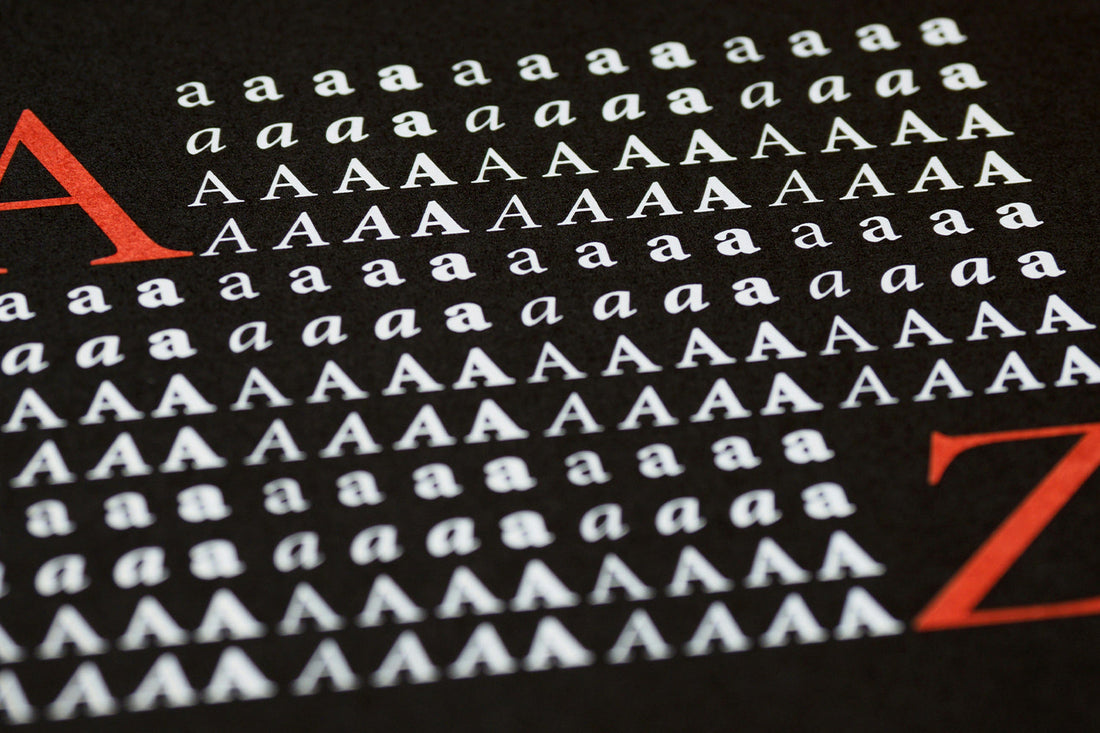
Typography is, quite literally, everywhere. How the written world is styled can make the difference between taking you seriously, or putting people into a playful mood. Stylistically, the right font choice is important in making sure you’re representing your brand the way you want it to be represented. Today, we'll explore some of the world’s most famous, well-loved fonts!
- Helvetica: A sans-serif typeface that's been used in logos for many brands. Designed by Max Miedinger, Helvetica was designed in an effort to create ‘a neutral, modern-looking, sans-serif font.’
- Futura: A geometric sans-serif typeface that's used by many brands. Designed by Paul Renner sought to create a font in this style because he ‘believed that a typeface should be precise, impersonal, and functional.’
- Garamond: A serif typeface that's based on old Roman lettering designs. Named after the designer himself, Claude Garamond, Garamond mimics pen and ink handwriting. It's known for its elegance and is still used today.
- Times New Roman: Developed by the duo of Stanley Morison and Victor Lardent, it’s the serif font that's associated with journalism and publishers use it for books and general printing. The goal was to redesign the existing typeface the Times had been using.
- Georgia: A serif typeface designed for use on the web that's often used for large blocks of text. Designed mostly by Matthew Carter, it was created for Microsoft in 1993, and was designed in an effort to achieve a font that would be legible on low-resolution screens and in print.
- Bodoni: A serif typeface designed by Giambattista Bodoni in 1798 that's used in advertising and the press. The font is best known for its straight hairline serifs and high contrast between thick and thin strokes.
- Franklin Gothic: A grotesque font that's most known for its use in industrial design. Designed by Morris Fuller Benton, for the American Type Founders (ATF) company, it’s best known as a top choice for advertising and newsprint.
- Avenir: A typeface that, in a way, marries the past and the future. Designed by Adrian Frutiger, its name literally means ‘future’ in French.
- Montserrat: A font with a backstory that's deeply rooted in construction and architecture. Designed by Julieta Ulanovsky, the font was heavily inspired by the posters, signs, and painted windows of the Montserrat neighborhood in Buenos Aires during the earlier twentieth century. Its development aimed to preserve the essence of this time period and location.
- Frutiger: A geometric sans-serif typeface that's humanist and versatile. Also designed by Adrian Frutiger, it is best known for its legibility for the reader even from long distances, in low light settings or if the reader is moving.
